
I’m a person who loves a good presentation. I love building them, giving them, and watching them. I’m also a person who knows they take time and effort. Like any creative process what that time and effort looks like is different for everyone. Here is my process:
Write The Abstract
Now I’m very aware step one should of course be doing all the research and then building the presentation, but that never happens. Step one is almost always writing an abstract for most folks I know.
This is a bad idea in a wide variety of cases. Starting with an abstract only makes sense in the following cases:
- You’re an expert in the field. I don’t mean good at it, I mean you’re confident you’ll be the top person in the room on whatever you’re discussing. If you’re #2 or 3 the people ahead of you better like you.
- You’re nuts and not afraid of failing on stage.
- There is no 3.
One last alternative is a talk you’ve given before. I’m mixed on that. Original content is key but audience matters more than anything. I’ll be talking through this process with a case study of a talk I’ve given before (once at a closed, very small event and once in a different hemisphere) and I’m giving again (for SANS CTI Summit). I’m fine doing this since 1) I basically rewrote the talk since the format (time) moved from 15–45 mins 2) the audience is completely different 3) for CTI Summit I’m adding the content and stage presence of Matt B.
An abstract is what it sounds like, but the the important thing is that in 4 or 5 sentences you get people to want to hear your talk. That’s more important than being a great summary of the work (which is a secondary consideration). You have to make the selection committee want to see your talk to get selected and you need to ensure attendees want to hear your talk and fill the room.
My recipe for this is either:
- be funny and/or enigmatic
- tell people what new thing they’ll be able to do after your talk
Here’s an example from our talk for SANS CTI Summit:
Homemade Ramen & Threat Intelligence: A Recipe for Both - Julia Child said “No one is born a great cook, one learns by doing.” The same thing could easily be said of threat intelligence analysis. In this talk you’ll learn the recipe and techniques for building an in house threat intelligence capability (as well a a great bowl of ramen). The focus will be on what you can do today, now, regardless of budget, fancy feeds, or background. Chef’s knife not required.
We went more silly funny for this one. What does 🍜 and CTI have in common? It’s clearly a metaphor but where we go with it is (I hope) intriguing. It also details the takeaway: how to build a CTI program (and as a bonus how to make some delicious Japanese soup).
Write Your Outline
Generally speaking I’ve already got the bones of the talk in my head when I start an abstract, but a formal outline is different. It needs to be fully fleshed out; not down to the slide level necessarily but at least to the major & minor sections. I build this out pretty slowly using a common pattern.
Highest Level
- Intro
- Body
- Conclusion
I know, not much, but it’s a place to start.
Medium Level
My dad knows his way around a good presentation and his format was beautifully simple:
- Tell ’em what you’re gonna tell ’em.
- Tell ’em.
- Tell ’em what you told ‘em.
Charmingly colloquial but also effective. When in doubt rule of three is a good pattern to follow. In fact I’m going to take the high level outline and break it into 3(ish) again.
Intro
- Who I Am (Branding)
- Why To Listen To Me (Authority)
- What I’m going to Tell You
Body
- Main Point 1
- Main Point 2
- Main Point 3
- Main Point 4 (Optional)
- Main Point 5 (Optional)
Conclusion
- What I Told You & A Key Take Away
- Reminder of Who I Am
- Resources
- Thanks (Not one of the 3 but important)
Your outline doesn’t have to be perfect or complete. I always end up changing a lot and moving things around but it’s important to have a start to begin editing from. Also avoid going over 5 main points for a typical > 1hour presentation or you’ll never get to it all.
Here’s my outline for the CTI Summit: cti-and-ramen.md
Lets take a look at our mostly fleshed out outline for CTI Summit: View the full outline on GitHub Gist
Outline Slides
At this point I take my outline and translate it into whatever I’m going to build my slides in. I used the simplest, most basic template imaginable and just get started knowing I’ll change things around.
This gets to the question of software. Honestly I don’t think it matters too much but here are my general thoughts:
- PowerPoint: It’s usually easily available in business settings and no one will blame you for it. It’s probably required if you have a corporate template. If you don’t it’s fine, but hard to make look like not PowerPoint.
- Google Slides: The Google office suite is feature wise lacking compared to desktop suites, it’s not missing anything key. My beef against it is the templating system doesn’t make it easy to really change the templates, so you better like what you start with. That said it’s the best way to collaborate remotely with a co-speaker. It’s also okay to build content in, then import into something else to tweak.
- Keynote: It’s Mac only, so either you have it or you don’t. Its design centric, so it’s possible to make really nice looking presentations, but it’s very hard to use if you’re not presenting off your own system. The PowerPoint export is all but unusable.
- Deckset: Another Mac only tool that’s nice because it doesn’t let you mess with things. There are static templates you can’t change and the only formatting available is Markdown. The themes are limited, but if you’re the only one using it no one will notice. If you’re one of 10 people using it, even with different themes, everyone will notice.
- JS Frameworks: There’s a wide variety of JavaScript/HTML/CSS based tool sets. They’re nice if you’re working with coders, but can take a lot of fiddling. They are nice for collaborating in a SCM like GitHub.
- Prezi: Don’t. No one wants to pass out from motion sickness watching your 7th slide do a 270 kick flip indie into slide 8.
In short pick what you like and what the hosts can handle. Thats an important detail (and sometimes it forces you to play fast and loose). Some places insist on PowerPoint while others want you to use your own machine and thus don’t care and everything in between.
#REALTALK: The first time I publically gave the ramen talk I started to use Keynote but started my slides late (Don’t be like me!) and got worried about timing. In order to help myself out and keep myself from fiddling I switched to Deckset. Deckset has the advantage of being difficult to fiddle with, so it is an easier way to get presentations out quickly. More on that later.
Pick a Theme & Gather Pictures, Fonts, & Colors
Ok, there’s a lot to this one so lets break it down:
Theme
When I say theme here I mean a grand idea for the presentation. Here’s an example:
Now the presentation was not about Game of Thrones, it was a hook, the theme. The theme, along with color, made it possible to tie concepts together, highlight transitions, etc. It also keeps things intereesting. Could I present the same content with black text on a white background? Sure, but you wouldn’t be as interested as waiting to see when Tyrion was going to show up on a slide (saved him for last just to take advantage).
Theme is fun and important, but don’t get too caught up in it. Your theme is a glue, don’t confuse it for the content itself. Use just enough to keep things together.
Pictures
Your theme is highlighted by the pictures. There is one key and one key only for pictures in presentations: BIG! Seriously you want the biggest images you can get, both in terms of size of image (# of pixels) and size on the slide. This is a fundimental problem with building presentations.
You build a presentation on your laptop screen and stuff looks fine. The image looks a tiny bit fuzzy, but it’s not a big deal right? Not on 13" 1440x900px, but at 16’ diagonal and an unknown resolution projector? Ugh… it can get messy. When I search for pictures for presentations I tweak Google to look for Large images (It’s under the tools Tools menu item):

Everything else aside from that with pictures is pretty minior. My only other thought is don’t over do it. Images should enhance your message for the most part, not dominate it (much like theme). I make heavy use of transparency (setting it down to less than 50% often) to soften the impact of images on my slides, but that’s just my style.
Size, Fonts, & Colors
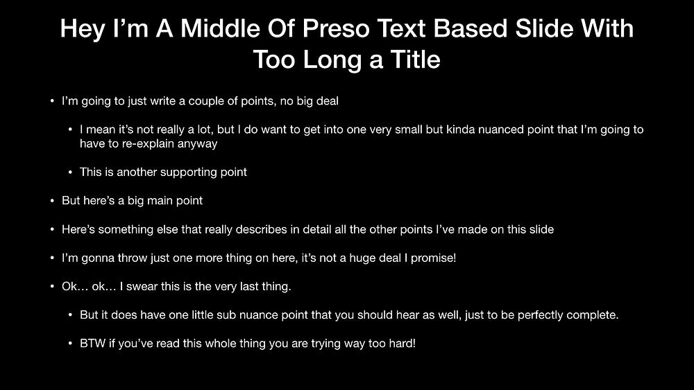
Okay this is where I might get a little bit ranty but it’s also the #1 thing people do poorly in their presentations. It comes down to two simple things:
- YOUR FONTS AREN’T BIG ENOUGH!
- YOUR COLORS DON’T HAVE ENOUGH CONTRAST!
Allow me to demonstrate with a commonly seen slide style:
Not great right? But keep in mind this isn’t what it looks like for people in the back of the audience it looks more like this:
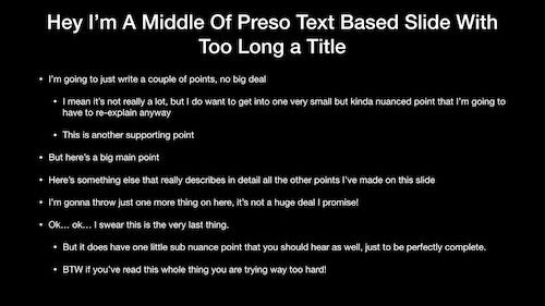
Being liable of causing eye strain aside its basically hard to keep track of and mind numbing to an audience member. Many people think that you need to have everything you want to say on the slide itself (in fact a certain school of Air Force presentation thought says slides should stand on their own without a presenter) but that’s garbage. The slides are there to back up the presenter, remind the audience, amuse, and maybe help you as the presenter keep your place.
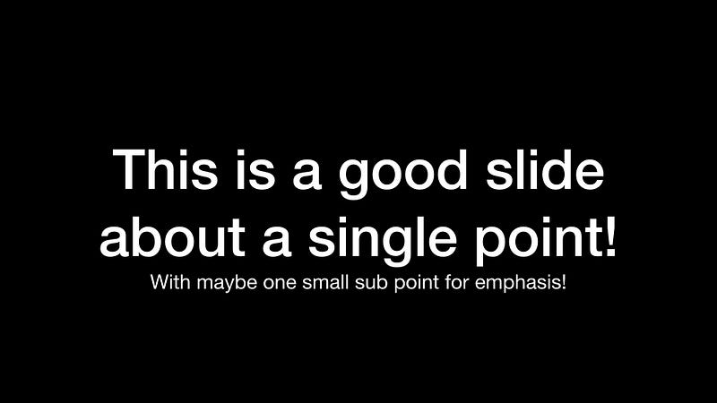
For me I would rather break that slide above into probably 5 slides or so that look more like this:
This gets us into fonts. Even the slide above isn’t great that way. The typeface is simple and readable, but we want 1) to stand out and 2) to be extremely readable even for the person in the very back sticking their head in to wonder if this is a better presentation to be in than the lame one they walked out of:
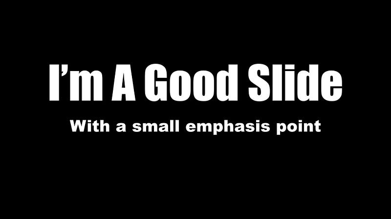
Now we’re talking. For this we changed the main text to the typeface Impact and the sub point to Ariel Black. These are both chunkier typefaces that make it much easier to read and focus your point.
The toughest part about typefaces is finding them. Designers put a ton of effort in to typefaces and they can often be pricey. Here are a few favorite sources stolen from Speaking.io by Zach Holman (who I’m going to give ample credit to later:
- caskroom/homebrew-fonts — Okay not technically fonts, but an easy way to get them.
- fonts.google.com
- LostType Co-Op
- The League of Movable Type
Font Aside: My friend @rtankrowbar had a great point about typefaces. Fonts aren’t embedded in presentation files, they’re installed on the system. That means when you send the file you don’t send the fonts. This is complicated if you’re not presenting off your own system. I’ve sent fonts to conference tech staff (they hate it), but mostly I try to use built in fonts for whatever application the conference is using. The alternative is web based tools like Google Slides where the fonts are included, but I recommend asking the conference organizers their preference.
Colors
What about colors? To understand colors you have to understand contrast. Here’s an example:
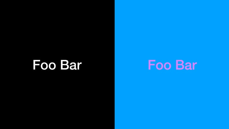
On the left we have very very high contrast (black and white having as much contrast as possible). On the right we have two colors with very similar color tone and thus low contrast. It’s obvious this doesn’t look great but to understand why I’ll use a trick my friend (and graphic designer/creative director/design person) Cameron showed me:

This is the same slide as above, but with the saturation turned to zero (so no color tones show up). What you see is while that purple and blue were very different the level of contrast was very very low. That’s why the right side, even with color, was hard to read. We want color sets with high high contrast to make it easier to read. Bold type faces can help, but the ideal slide will have both. (By the way that saturation trick is a good way to test out if your slides have enough contrast. A good slide should still work with zero contrast.)
Projectors vs Non-Projectors: Presentation medium makes a huge difference. Contrast is especially important if you’re using a low power projector in a bright room. If, just say, you were doing a webcast or going to be in a known dark room with a high power projector then you can be a little less particular about these.
Once you get past contrast colors can be whatever you like really, though I try to fit the theme. In general I think of three main colors:
- Background: Almost always a big neutral. Black or white work easily but using the right colors can make slides pop.
- Base Text Color: Something super super high contrast with the background color. Maybe something easy on the eyes so avoid neons.
- Accent Color: So something very different than your base text color, usually something bright and noticiable. The goal is to call attention. I’ll often use a different typeface for my accent text as well, just to extra make sure it stands out.
With those three I can form the vast majority of attention getting constructions. Here’s an example from a presentation I gave with GitHub:
SpeakerDeck: Introduction to Open Source Security Tools
- Background: This varied a slight bit slide to slide (Yep you can do that too!). I used white backgrounds to denote major sections. The general slides used a bright (and on brand for GitHub) blue.
- Base Text: This swapped with each background with black text on the white section slides (contrast for days!) and white text on the blue backgrounds.
- Accent Color: Used very very sparingly (which you should do with your accents in general) I used a medium grey. Normally I’d want more contrast but this presentation was done for a webcast, so I was less worried about it than on a projector screen.
Where to find color schemes? After some trial and error I can usually make one up, but until then I’d either look at other people’s slides and crib off them or try a color selection site:
Build The Content
Alright, so you have a design (color, typeface, etc) and an outline, maybe even some pictures and a theme; the basics of what you want to say. At this point I begin putting my outline into slides building a skeleton of the presentation in my presentation tool of choice.
I’ll be honest, I can’t tell you how to do this part. It’s all about you, the topic, your style etc. Here are a few tips though:
- Less on a slide is more. Everything word you add is more people have to pay attention to. Pictures can often replace paragraphs.
- Move stuff around like mad. My initial skeleton and end presentation look nothing like each other and that’s part of the plan. Laying the whole thing out and moving it all around is the only way to know what works.
- Write stuff, edit stuff, walk away, look at it again. You’ll have insights you’d have never thought before.
- Think as much about what you’ll say during each slide as what’s written on it. This can often change your words or image thoughts.
All through the process I’ll walk through the entire presentation as though I’m mini giving the whole presentation. I’m always looking for places I don’t know what to say or places I’m trying to say too much. Places where 20 words could be 5 words and places where 10 words could be an image.
I also make notes throughout the whole presentation, using the presenters notes features. These are useful for me practicing and may be useful for giving the presentation as well.
Practice your Slides
Another piece that I think is super personal is how you practice your slides. My method is multi part, and is as much about pre-practice prep as anything. While I’m building my slides I read through them generally dozens of times. I make lots of notes, even knowing I’ll never reference them. They’re more about remembering what I need to remember (super meta right?).
About a week out I’ll do a full practice which literally means being on two screens, so I have a speaker view and presentation view, bust out my presentation clicker (more on that later), stand up, and give the whole thing end to end. I’m looking for places I don’t know what to say, general feel, pieces that feel strained. Typically there are a lot of these. This by the way is a super process awkward but overwhelmingly helpful. It’s like reading a paragraph of text out loud (which I often do while editing). You hear things you miss otherwise.
Wanna go for bonus points? Keynote lets you record your practice.
At this point I rebuild, make changes based on my notes and practice. I do this almost immediately, while the ideas are fresh. Then I walk away…
And come back a day or two later. I’m concerned about two things: Were my ideas about rearranging stuff as good as I thought and do I remember enough of the content to get up and give this presentation. If I can’t get through it content wise then I need to study up and focus.
My last practice is usually the day before and here my focus is on timing. Will I hit my marks (I generally think of the presentation/time in quarters). How will I know when I’m lagging, how will I know where I can make time if I’m going to fast. Is there a charming anecdote that will take too long?
Aside: When in doubt timing wise it’s better to be short than long. This is doubly important if you are the last presentation before a break like lunch or the end of the day. Five mins early: You were concise. Five mins over? You’re causing problems for organizers, annoying the person after you, and look sorta like a blow hard. It’s a fine line.
At this point breathe and trust. Being under practiced is bad but so is being over practiced. Unless you can get to a TED Talk level of polish (and I don’t know many people who can) it’s okay to be a little go with the flow. Over practiced can just lead to seeming stiff and over-rehersed. The best presenters in my opinion share like they’re talking with a friend (and you don’t reherse every discussion you have with friends do you?). Know what you want so say, have some idea how you want to say it, but be loose and relaxed.
Give your Presentation
Seriously, you’ve got this! In this way a presentation is like an iceberg. The vast majority is below the surface. You’ve aleady done the hard work, have great slides, practiced, and you’re ready.
Ok… there’s a little bit to the actual presenting, but not what people think. When I see folks have problems, especially new speakers, the issue isn’t usually their ability to talk on stage. Here are a few important ideas that I think can prepare you to be awesome once you start speaking:
Work Out Your Equipment (AHEAD OF TIME!)
One of the biggest pieces that trips up novice speakers (aside from font choices) is equipment. Generally speaking you’ll have four key pieces of equipment to think of: a remote, a computer, a projector, and a mic.
- Remote: Honestly you want this to be boring, not intersting. I prefer to use my own but they’re all the same. I use a Logitech R800 and practice with it as well. I know the buttons without looking and know the range without it missing a click. If the venue requires something else I go with it, but try to give it a try first.
- Computer: Often you won’t have control of this and just need to use whats there. It’s easiest for you if you can use your own computer and easiest for the conference if you use their system. Ultimately I try to be prepared for either. The big issue is connectivity: always have the ability to connect your system to HDMI and to VGA.
- Projector: You you can’t control the projector in most cases which is why you make your slides projector proof: big words, big pictures, maximum contrast. If you’re lucky they’ll have some big, high lumen projector with a nice screen and everything will pop. If you’re unlucky and it’s an old projector against a white wall… well your slides will at least be readable.
- Microphone: If you’re not used to using one a microphone can be a comedy of errors including feedback, being too quiet, being too loud, pops, etc. I always assume/hope for a lapel mic, the kind that they clip to your clothing (and wear something easy to clip to like a polo or button up shirt) so I can just talk & move without thinking about it. Hand held mics are okay, just keep it close to your mouth (seriously watch professionals use them, it looks like they’re eating an ice cream cone), but the worst is a podium mic. 😢 I pace & move when I talk and you can’t do that with a podium. Again just stay close to it. No mic? Be louder than you think you need to without shouting.
Another Aside: Like a gun always assume a mic is ready to be used. Once you’re mic’d up assume everything you say is going to everyone and anyone. Even if it’s not over the public address system the venue may record and you don’t want to find out the hard way.
The biggest thing is to know what to expect and be prepared. The best way to do this is reaching out to the organizer/venue beforehand. Once you’re there you just need to do the best you can.
Lead In with a Joke
I’m not usually comfortable until the first time I get the audience to laugh. I don’t know why, this is a magic phase change to me. I suddenly start to feel comfortable, get out of my own head, and focus on the topic. Here’s one I use very often during my intro stolen from a coworker (Thanks Jesse!):
I work for GitHub. If you haven’t used GitHub before we’re a sticker and t-shirt company but we’re getting into git hosting and I think it’ll be big for us!
Look it’s a dumb line but it gets a chuckle every time. It’s important just for getting me over the psychological hump and I find that’s a hump many other speakers have. You’ll have to work out your own (Unless you work for GitHub then feel free to steal it from me too). I’ve also used:
Welcome to <INSERT NAME OF THE TALK>! This is my three and a half hour lecture on <INSERT CORE TOPIC>! <LOOK TO THE SIDE CONFUSED> Oh… I don’t have three hours? 45 minutes?! We better get started!
Again Jerry Seinfeld level comedy it isn’t but it helps. Not a big joke writer (clearly neither am I): consider using a funny gif or image early on to get your laugh.
Source: Giphy
Here’s a good GIF for early in a presentation. RIP though… maybe not a good one.
Speak Slowly & Calmly
Public speaking makes people nervous and for many, including me, those nerves come out as speaking quickly. I conciously force myself to slow down, especially at the beginning. Eventually the practice will take over and you’ll find your natural rhythm but until then give yourself a quick self reminder to speak slowly. Also if you struggle with enunciation think that through as well. Mumblers are quickly tuned out by many people so focus on slow and understandable.
Being Nervous is Okay
We’ve touched on this but lets have some #REALTALK about nerves. In many ways being nervous before a talk is an imposter syndrome thing and talking about it is the key. I’ve spoken publicly dozens of times, taught 40 hour classes, done work presentations, briefed leadership, lots of stuff and I still get nervous every time I speak no matter the audience. In fact writing this blog post is making me nervous. So don’t worry if you are nervous, everyone is. Just remember by the time you walk on stage you’ve done the work, built your slides, practiced, and you were selected because you have something interesting to say and people want to hear it. Easier said than done, but that’s the truth.
Roll with the Punches
Present enough (and by enough I mean even once) and stuff will go wrong. It’s not fun. Devices don’t work, batteries die, people in the audience do dumb stuff; if it can go wrong it will. Let me given an example from my last presentation.
Scott & The Tale of the Missing Adapter I was presenting in Brazil at Mind The Sec. It was a great event. However I made a mistake in preparation. I put my presentation together assuming I could present of my own laptop, a 2016 MacBook. If you aren’t an Apple fan you might know what’s coming but if not the beauty (and in this case downfall) of the Macbook is it only has one connector and it’s USB-C. You need dongles. And I was prepared for that, I had my usual go to USB-C ➡️ HDMI adapter ready to go.
Except the venue didn’t have HDMI connector but only VGA. So they asked me to transfer it to a PC. Sadly I was using Speakerdeck… which is Mac only. Not great. So what did I do? Took a draft version of the presentation, which I’d started in Keynote, exported it to PowerPoint, and gave them that. The content was all there, but zero styling… none. So what did I do? Laughed at myself, was extra descriptive, and did my best to hit my points. What happened? Well everyone told me it was great. I choose to believe them.
Was it ideal? No. I was super disappointed, but the folks who came to see me didn’t need to know that. They wanted the content and I wasn’t going to let one problem get in the way. Roll with the punches, you can make it through.
Call Attention to your Presentation
This is something I don’t think anyone, including me, does enough of. Make use of your presentations after the fact. A couple ideas for this:
- Upload your slides: I use SpeakerDeck. An alternative is Slideshare. Either is great and lets you point people to what you’ve done.
- Link to your presentations: I share them off my site. You could share them via Twitter. Get eyes on those slides you spent all that time on, and video is even better.
- Convert to Blog Posts: I am trying to convert a number of my presentations to blog posts (except the ones that started as blog posts and became presentations). If I don’t plan to give it again it seems to make sense.
I’m sure there are more good ways to do this. If you think of some please let me know.
Getting Started Speaking in Security
If you’ve gotten this far I hope it’s because you’re thinking about presenting. If you are on the fence please take the advice of my good friend Shia:
So how do you get started? For new speakers I really like local Security BSides events as a place to get started. I’ve had great experiences at these events, they tend to be a comfortable size (I get it, no one wants to start with a 1000 person ballroom), and encouraging of new folks. In addition many conferences are adding new speaker friendly events such as BSidesLV’s Proving Ground. SANS DFIR events are also incredibly encouraging of new presenters pairing everyone up with a mentor to help. We’ve had multiple first time speakers absolutely rock such as Christian Paredes excellent Pen-To-Paper and The Finished Report: The Key To Generating Threat Intelligence at the CTI SUMMIT 2017.
Not sure if your idea or slides are ready? Submit and ask the conference for a mentor! Not ready for that? Reach out to me and I’ll help. Whatever it takes. Share, you can do it!
Conclusion & Resources
Even I’m tired of this post at this point, but I hope you’ve found some ideas or resources that will help. If you’re looking for more (and you should, in all my rambling I’ve hardly touched on many topics) here are a few I like:
- http://speaking.io — Zach Holman’s guide that taught me a ton. It’s a must read.
- Toast Masters — I’ve never done Toast Masters but I know people who swear by it and many of those people are excellent speakers. This tip sheet is great.
- Forbes: Six Ways To Be An Amazing Public Speaker — I really like this article. It touches a number of key points, especially around audience.
Lastly watch, critique, create, and practice plenty of presentations. Like someone else’s slides? Look at what they did and emulate them. Loved a verbal trick someone used? Add it to your own bag of tricks. Learn from others, teach others, and grow.
TLDR: Your images are too small, your fonts are too small, you have too many words, your colors don’t have enough contrast.